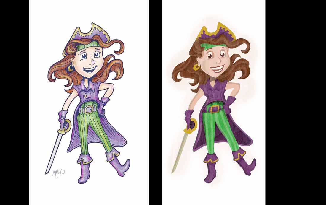
 Still making style decisions. I decided to take a piece from last year and redo it in the flat color style with no lines. Not sure which is better. They both have their charms. It still feels slightly uncomfortable to do it the second way but I do like it somewhat and it may be more marketable. I wish I had my own art director to ask.
0 Comments
  Hi friends,
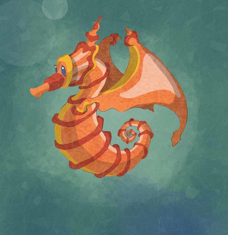
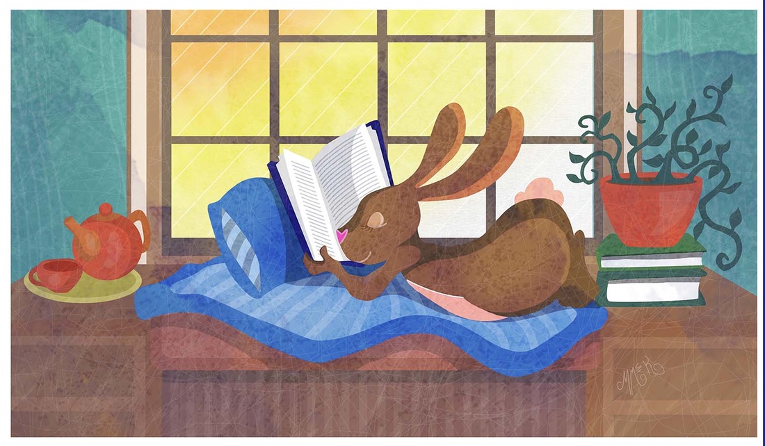
I'm back to talk about what has been going on. I have been super busy this week and last. It felt like I'd never get the time to really get to work on the book but the time finally came. Too bad I got sick at the same time, I had basically one day of work before being totally sick and have been ever since. Fortunately being sick paid off in at least one way... it made me have less guilt for sitting still so long each day. I actually ended up staying on schedule with the illustration chart that I created months ago to tackle during this time period. So yay! Right on track. In other news... still working on the painting style that I will eventually use on the illustrations for the book. I won't touch any of them with color until I am done with all of the composition and drawing work. Therefore in the meantime I am trying out new things with my weekly random illustrations, usually incorporating the color of the week from the twitter group colour_collective. So last time I posted here I shared the image of the girl on the bike. This was the first of several images that I have been testing out the new style of taking out all my linework. I love linework but I am not positive that it is the best fit for children's illustration. It is more widely used in comics and cartooning. I have been doubting my work because of this for a long time. At the same time I worry about changing just to suit 'them'... my imaginary critics. In reality, I don't get enough feedback from actual editors or publishers or successful illustrators to be able to adjust my work appropriately. So while I don't know which direction I should actually go in, I thought that it wouldn't hurt to try it out and see what I think about it after I have several pieces to reflect on. If possible I will be seeking more of the helpful kind of feedback mentioned above at some point. The two images above are both in the flat color sans line work style that I am referring to. To see my previous style just go back to my home page and take a look at all but the top three or four images. There is a difference in these two above images that is also worth noting. In the second one- Bunny Quiet Time I tried yet another new trick- that of creating all major color areas as vector graphic shapes in Adobe Illustrator and then bringing them one at a time into Photoshop as separate layers and then continuing with my normal finishing methods of shading, highlights and textures. This created much more smooth edges. Maybe too smooth. I am still deciding. Always with line work I didn't have to worry at all about the quality of edges where two colors meet because the lines covered up any edges. So this is new territory for me and I am still deciding how I want to handle it. That's is for this week. Thanks for reading.... MM |
MistyThanks for stopping by. I'm a published illustrator working on getting better every day. My goal for my work is for it to be charming, bright and endearing. I share my ongoing work progress online because I welcome all the encouragement and feedback I can get as I try to improve my skills. I currently have a children's book project that I am nearing the end of. Archives
February 2017
Categories |
 RSS Feed
